suite-hearts: me + him {the final to-do}

The crickets that you hear are because life interfered in blogging. In a good way. My last post was October 6, five days before Bryan and I celebrated our wedding. And the last two months have been filled with travel and getting back on track. Sprinkled with a few holidays and a not-so-sweet case of the flu to shake things up. Awesome.

Back in late summer, I posted the "Suite-Hearts" designs for our own Save the Date and Main Invitation. Check them out, if you havn't already.

Each year, I have the unique opportunity to create bridal stationery suites for couples looking for the ultimate in customized solutions for their wedding - and it is truly one of my favorite projects. Super creative, very personal, and always tangible. And while the paper itself might have a short shelf-life, the reason behind the project and the memories created, do not. For a designer who is often doing more business-focused work, it can be a welcome distraction to color outside the lines. 

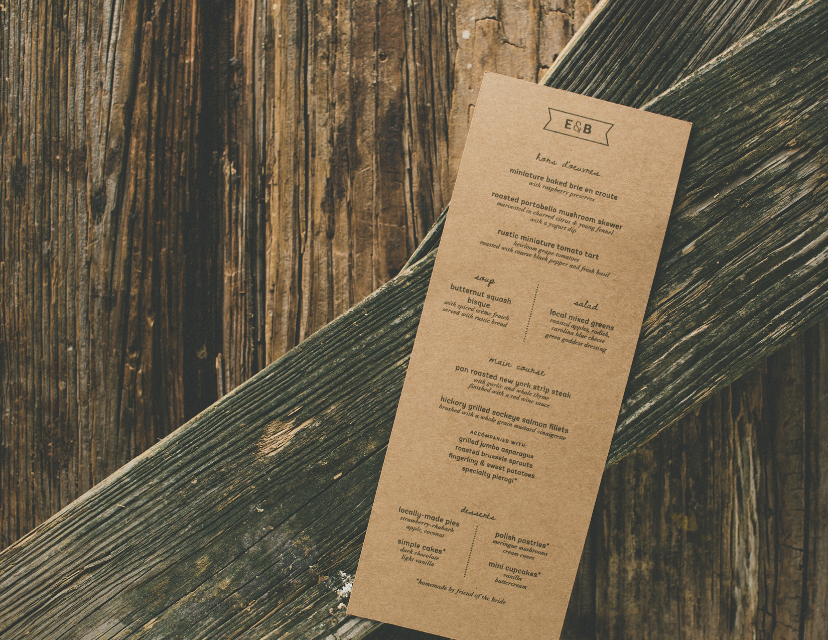
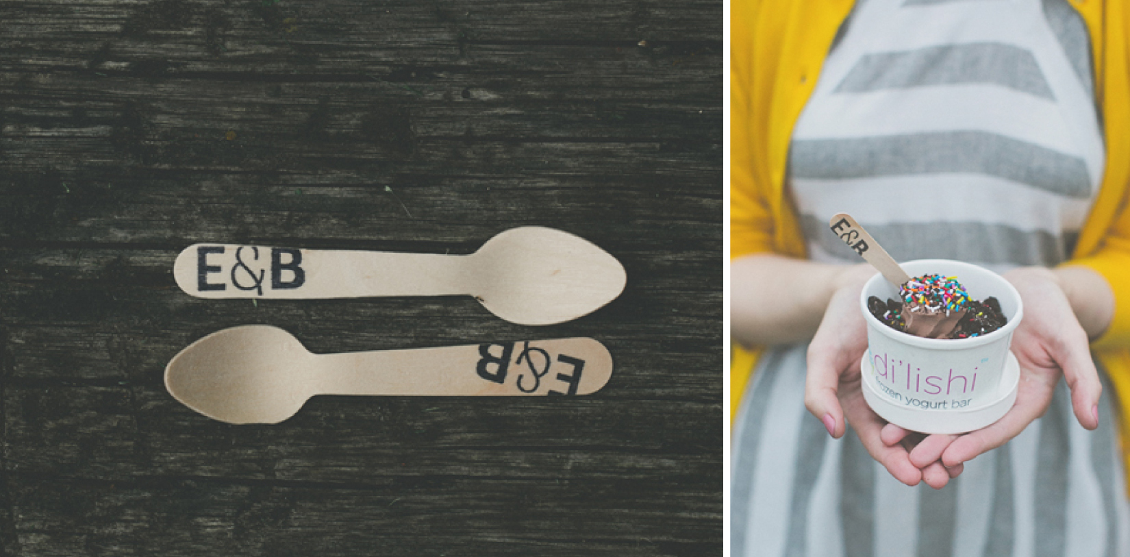
The final piece to my own bridal suite was in the "day-of" implementation. Most times, a suite-hearts package extends beyond just the invitation -- in our case, to menus, programs, golf cart signs, marriage certificate, custom honey labels {favors}, lantern tags and fro-yo spoons. And just in case I wasn't DIY-crazy enough, I handmade the boutonnieres {with coordinated pennant tags}, all table florals, bouquets, and clay name tags {on dinner napkins}. 

First up, the design proofs.

Friday Dinner Menu and Friday Ceremony Program - Erica & Bryan 10.11+12.13

Friday Dinner Menu and Friday Ceremony Program - Erica & Bryan 10.11+12.13

Custom Golf Cart Sign and Marriage License - Erica & Bryan 10.11+12.13

Custom Golf Cart Sign and Marriage License - Erica & Bryan 10.11+12.13

Saturday Program {tri-fold, outside} - Erica & Bryan 10.11+12.13

Saturday Program {tri-fold, outside} - Erica & Bryan 10.11+12.13

Saturday Program {tri-fold, inside} - Erica & Bryan 10.11+12.13

Saturday Program {tri-fold, inside} - Erica & Bryan 10.11+12.13


 And photography by the always-amazing, insanely-talented, The Schultzes

Save the Dates - Erica & Bryan 10.11+12.13

Save the Dates - Erica & Bryan 10.11+12.13

Invitation Suite and DIY Bouts - Erica & Bryan 10.11+12.13

Invitation Suite and DIY Bouts - Erica & Bryan 10.11+12.13

Friday Ceremony Program - Erica & Bryan 10.11+12.13

Friday Ceremony Program - Erica & Bryan 10.11+12.13

Friday Dinner Menu - Erica & Bryan 10.11+12.13

Friday Dinner Menu - Erica & Bryan 10.11+12.13

Friday Dinner Menu, Place Setting and Custom Honey Label - Erica & Bryan 10.11+12.13

Friday Dinner Menu, Place Setting and Custom Honey Label - Erica & Bryan 10.11+12.13

Custom Honey Label - Erica & Bryan 10.11+12.13

Custom Honey Label - Erica & Bryan 10.11+12.13

Saturday Program - Erica & Bryan 10.11+12.13

Saturday Program - Erica & Bryan 10.11+12.13

Custom Fro-yo Spoons, modeled by Maid-of-Honor / Sister of the Bride / Designer Extraordinaire, Bryce

Custom Fro-yo Spoons, modeled by Maid-of-Honor / Sister of the Bride / Designer Extraordinaire, Bryce

Lantern Tags - Erica & Bryan 10.11+12.13

Lantern Tags - Erica & Bryan 10.11+12.13

design: honey labels

Oh, matte black. How do I love thee?

When we set out to create packaging for our inaugural honey season, we wanted as much of the amber product to show through as possible. We sought high class, but wanted to still resonate as a pure, local product. We hopes to accurately represent each individual farm location, as the honey will taste slightly different based on what is growing in each area. {For example, Rocky Creek is home to a rare Sourwood tree that makes an exquisite honey.} And, we wanted it to stand out, but stay simple. 

So, we started with a hex jar, to align with the tile flooring we have in our honey processing house, and of course, honeycomb. We drew from the clover element within the logo for River Taw Farms (or first location for hives) to create the bee graphic, and kept the typeface clean, sans serif and delicate. And we utilized the space on the top of the jar lid to allow as little label to cover the honey itself. 

Combined with some quippy copy, a matte-metallic stock and a pop of color throughout, we felt confident releasing this "black label honey" to local vineyards, small general stores, boutique restaurants and gift stores in the greater Charlotte-Statesville-Cherryville area. There may be a few jars hanging around in our homes and offices too, ready to give to those who show up on our doorsteps.

100113_PortfolioPrintUpdate.jpg
100113_BlogHoneyLabels10.jpg
100113_BlogHoneyLabels11.jpg
100113_BlogHoneyLabels12.jpg
100113_BlogHoneyLabels13.jpg
100113_BlogHoneyLabels14.jpg
100113_BlogHoneyLabels15.jpg

As with any design project, it's "never done" -- and there are already a few edits I would make to our next run. But, product design is one of those challenges that requires both an analytical and a creative approach. In the case of the honey jar labels, one has to make sure that (a) all "required" state/local info is on the label, (b) that is it is correctly conveyed to the end user in such a way that it grabs their attention just by sitting on a shelf, (c) that it stands out amongst *many* competitors in this market and most importantly, (d) that the label actually FITS the jar correctly, especially when it is a unique or custom size. We worked with Frontier Label in our "backyard" of Greenville, South Carolina on this project, and would recommend them to anyone. I am sure that our product design will evolve over time, just as anything does, but for now, simple is sweet enough.

Interested in purchasing a jar of honey, or bees to start your own hive? Contact me for more information.