

2014 marks the fifth anniversary of my mini-calendars. When I started this project, I was searching for something that would combine photography and design together, as well as be part "client gift", part promotional material. And so, the mini-cal was born.
In it's history, the images within calendar are from the previous calendar year. Travel adventures, observations close to home, some "themed" with concepts close to my heart {i.e. 2013 "Equus"}, some captured on a whim, some the result of photographic intention.
Before we dive into 2014's edition, a look back on the previous pieces:
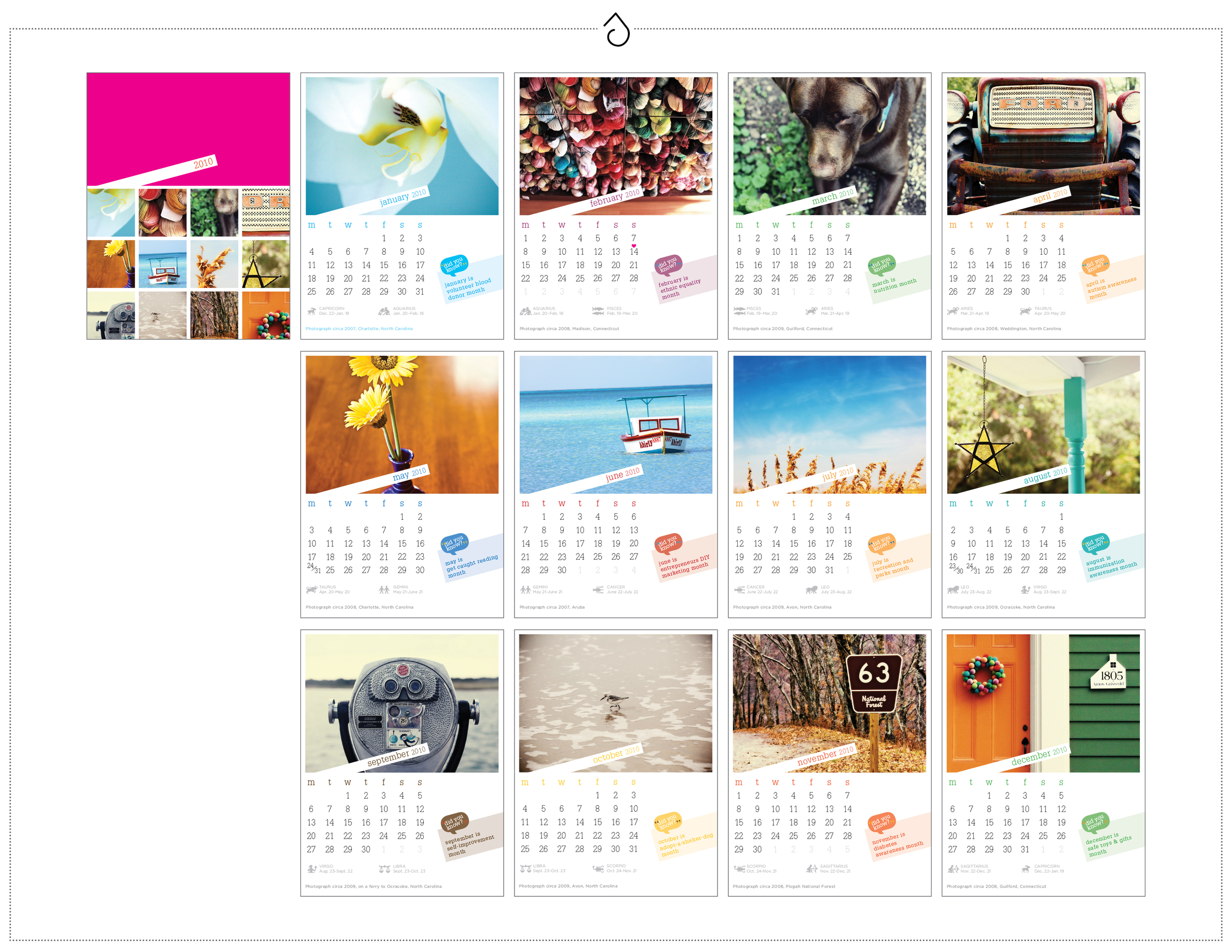
Twenty-Ten {2010} - The very first mini-cal. Featured images from life itself, NC to CT, small moments or objects. 4.25 x 5.5, on 14pt recycled matte with soy-based inks. Packaged in a kraft folio.

Twenty-Eleven {2011} - The Alaska Edtion, featuring images from our cruise through the inner passage in SE Alaska aboard the MV Mist Cove with The Boat Company {yes, the sea lions really were *that* close}. 5 x 5, on 14pt recycled matte with soy-based inks. Packaged in a glassine envelope.
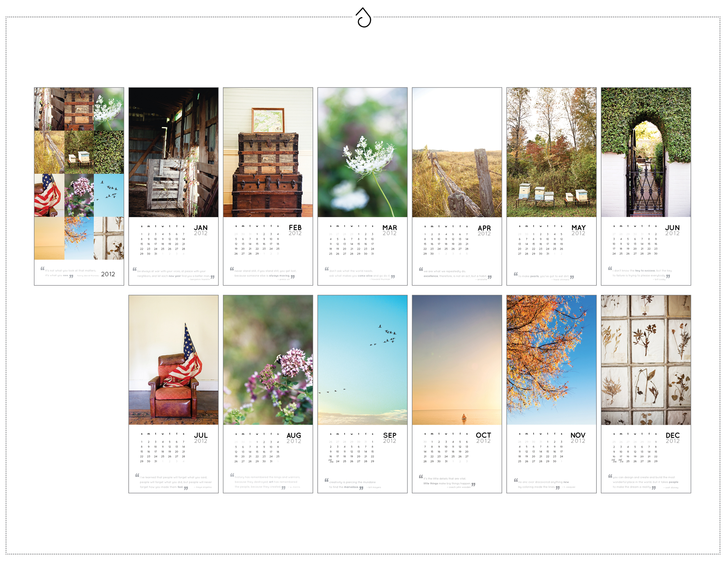
Twenty-Twelve {2012} - Images from around local farms, abandoned homes and other rustic travel adventures from '11 - featured in a vertical format. 4.25 x 9, on 14pt recycled matte with soy-based inks. Packaged in a kraft open-end coin envelope and sealed with washi tape.

Twenty-Thirteen {2013} - Oh Equus. How you are close to my heart. This edition features images from the previous year of my life in horses, all models shown I know and love. {And of course my own Lola makes several appearances} 4 x 6 horizontal, on 14pt recycled matte with soy-based inks. Packaged in a hand-stamped muslin bag with kraft pennant tag.
And so, when it came time for 2014, and I looked back on all of the life changes, memories and images the previous year has held, the choice was obvious. This year's fifth-anniversary edition would feature photographs from Rocky Creek, a place that has become so special to myself, my husband and our family and friends over the past 12 months.
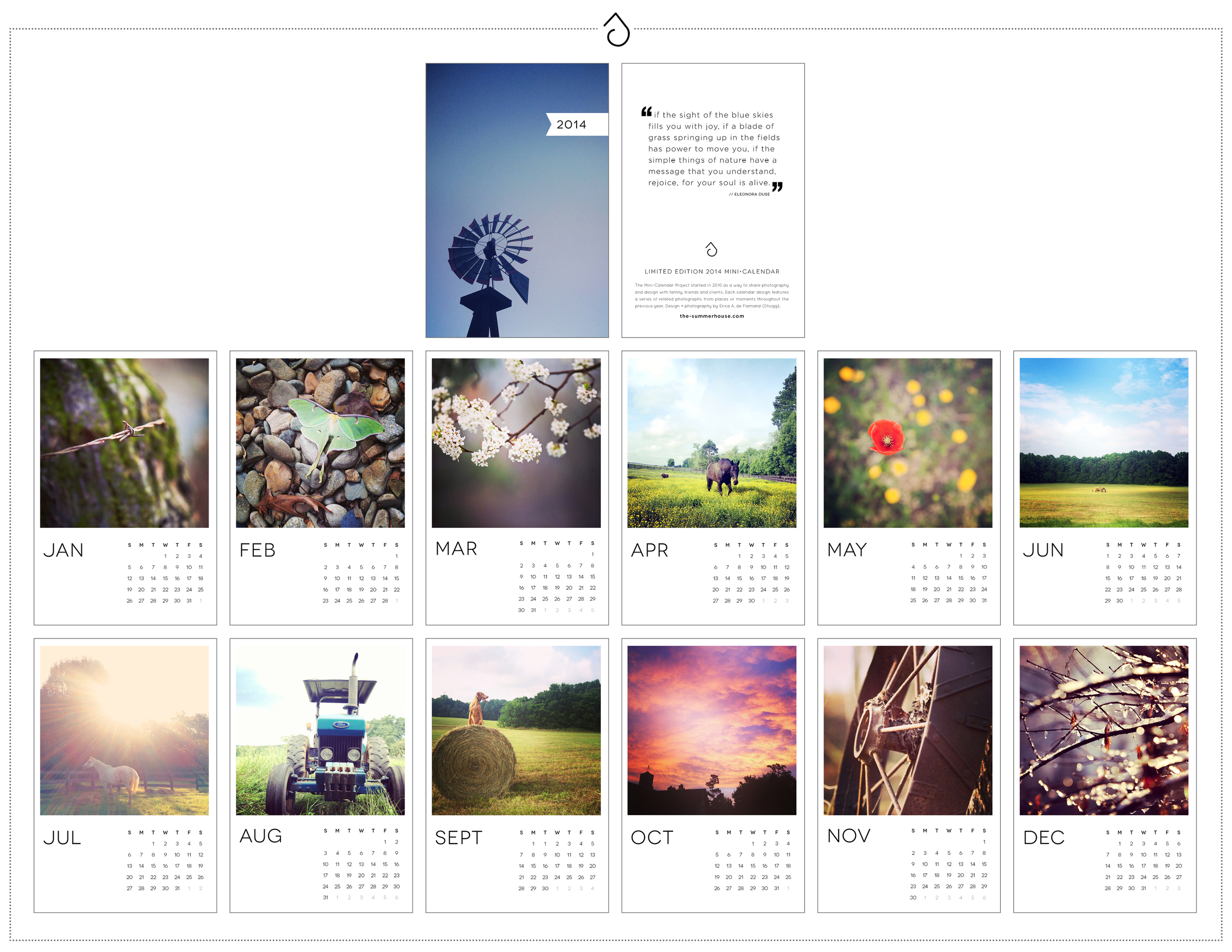
For some receiving this calendar, the images are familiar, as they graced our wedding RSVP cards not that long ago. For me, the images will keep my mind and heart motivated through 2014 as we work to share this property with others in need.
And on the inside cover, this quote:
"If the sight of the blue skies fills you with joy, if a blade of grass spraining up in the fields has power to move you, if the simple things of nature have a message that you understand, rejoice, for your soul is alive."
// Eleonora Duse
{Copies of 2014 still available - contact me if you would like one!}


