spring matters

To say that I am ready for spring, would be an understatement. I am not about to complain about our otherwise "mild" winters in NC {as my family in CT continues to get snow on a weekly basis}, but ... I am so ready for spring. 

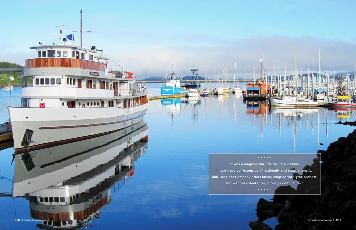
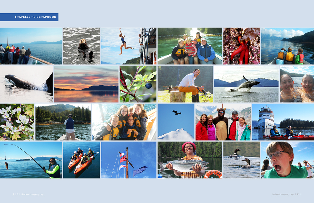
Projects that tend to come across my desk this time of year are fresh "new year" branding projects, wedding invitation suites, and one of my favorites, The Boat Company spring newsletter. TBC has been a client of mine for almost a decade -- we have "grown" together -- and in addition to having creative freedom and wonderful content to work with, I always learn something from each project. And I don't mean a "design-something," I mean a "real-life-bigger-picture-something." Something that matters.

We dove into the newsletter design for this spring season {which will be distributed about one month before cruising begins}, with a focus on the sport fish issues in Southeast Alaska. Sport fishing in Alaska -- mainly salmon and halibut -- drives the state's economy. And lets not forget, just because they are in the upper left-hand-side of our world, doesn't mean that their economy *doesn't* affect the bigger picture. That it doesn't trickle down to us, all the way over here on the east coast. Because it does, in a big way. 

Lucky for us, Alaska had a record-breaking year for sport fishing of salmon. Which means, economic growth for them, and higher quality of life {and food} for all of us.

However, there is also a big issue in Alaska with "fisherman" who are trawlers. Bottom trawlers in the Gulf of Alaska catch, kill and discard huge numbers of salmon and halibut each year, which inflicts untold harm on the marine ecosystem. It also hurts directed harvesters, i.e. fishing men and women who use much more selective hook-and-line methods to target these species for small-scale commercial, subsistence and sport purposes. 

In addition to providing the highest quality in small-boat luxury cruises, The Boat Company {a non-profit organization} goes to bat on issues like this. They have taken The National Marine Fisheries Service (NMFS) to court in an effort to get them to pay attention, and put a plan in place that will help ensure our nation’s marine resources are managed sustainably.

And TBC stitches everyone together in their mission by kindly, yet directly, sharing it with the community through their newsletter. Yet another reason that designing this spring newsletter really matters.

“Earth provides enough to satisfy every man's needs, but not every man's greed.” 
― Mahatma Gandhi

design: honey labels

Oh, matte black. How do I love thee?

When we set out to create packaging for our inaugural honey season, we wanted as much of the amber product to show through as possible. We sought high class, but wanted to still resonate as a pure, local product. We hopes to accurately represent each individual farm location, as the honey will taste slightly different based on what is growing in each area. {For example, Rocky Creek is home to a rare Sourwood tree that makes an exquisite honey.} And, we wanted it to stand out, but stay simple. 

So, we started with a hex jar, to align with the tile flooring we have in our honey processing house, and of course, honeycomb. We drew from the clover element within the logo for River Taw Farms (or first location for hives) to create the bee graphic, and kept the typeface clean, sans serif and delicate. And we utilized the space on the top of the jar lid to allow as little label to cover the honey itself. 

Combined with some quippy copy, a matte-metallic stock and a pop of color throughout, we felt confident releasing this "black label honey" to local vineyards, small general stores, boutique restaurants and gift stores in the greater Charlotte-Statesville-Cherryville area. There may be a few jars hanging around in our homes and offices too, ready to give to those who show up on our doorsteps.

100113_PortfolioPrintUpdate.jpg
100113_BlogHoneyLabels10.jpg
100113_BlogHoneyLabels11.jpg
100113_BlogHoneyLabels12.jpg
100113_BlogHoneyLabels13.jpg
100113_BlogHoneyLabels14.jpg
100113_BlogHoneyLabels15.jpg

As with any design project, it's "never done" -- and there are already a few edits I would make to our next run. But, product design is one of those challenges that requires both an analytical and a creative approach. In the case of the honey jar labels, one has to make sure that (a) all "required" state/local info is on the label, (b) that is it is correctly conveyed to the end user in such a way that it grabs their attention just by sitting on a shelf, (c) that it stands out amongst *many* competitors in this market and most importantly, (d) that the label actually FITS the jar correctly, especially when it is a unique or custom size. We worked with Frontier Label in our "backyard" of Greenville, South Carolina on this project, and would recommend them to anyone. I am sure that our product design will evolve over time, just as anything does, but for now, simple is sweet enough.

Interested in purchasing a jar of honey, or bees to start your own hive? Contact me for more information.