print design: twenty-fourteen

2014 marks the fifth anniversary of my mini-calendars. When I started this project, I was searching for something that would combine photography and design together, as well as be part "client gift", part promotional material. And so, the mini-cal was born.

In it's history, the images within calendar are from the previous calendar year. Travel adventures, observations close to home, some "themed" with concepts close to my heart {i.e. 2013 "Equus"}, some captured on a whim, some the result of photographic intention. 

Before we dive into 2014's edition, a look back on the previous pieces:

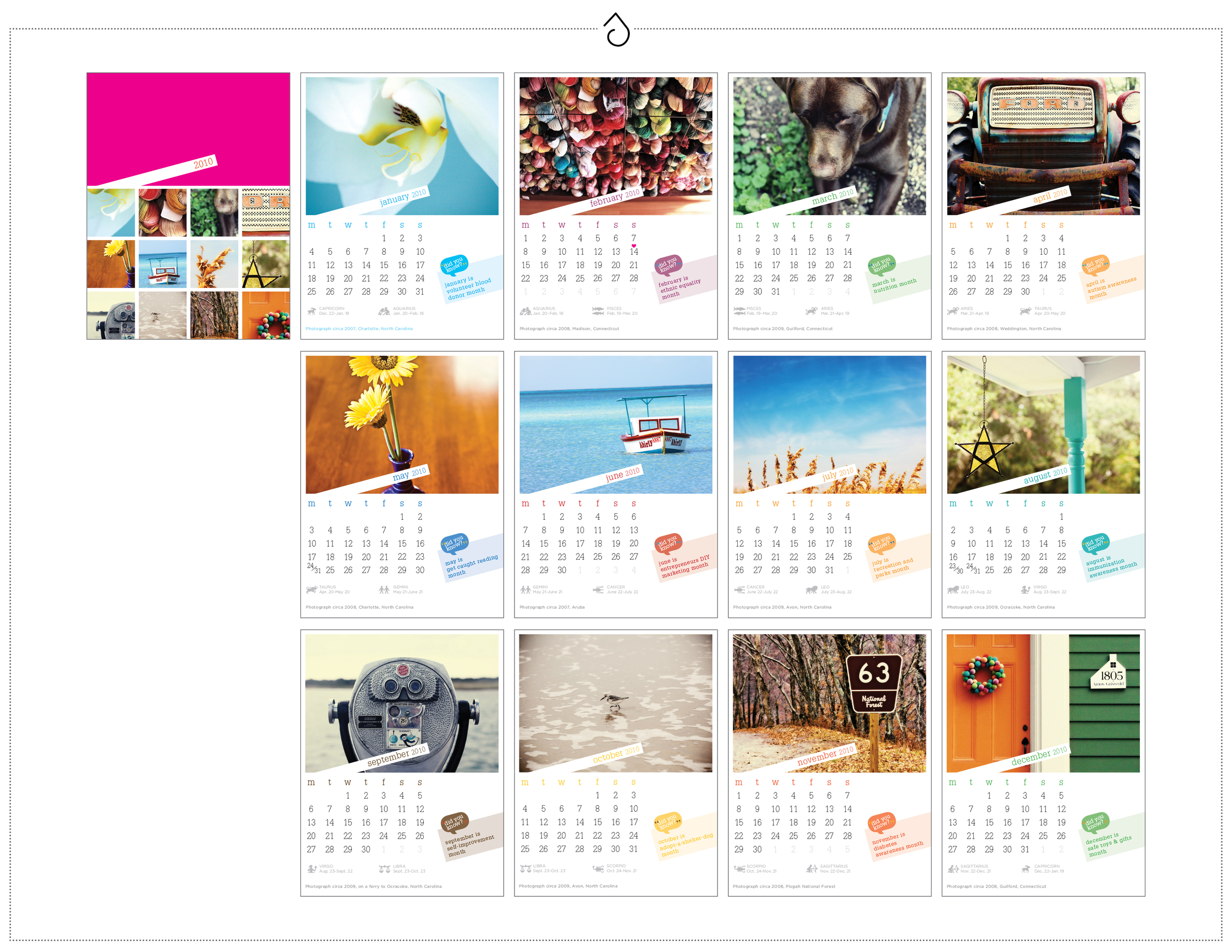
Twenty-Ten {2010} - The very first mini-cal. Featured images from life itself, NC to CT, small moments or objects. 4.25 x 5.5, on 14pt recycled matte with soy-based inks. Packaged in a kraft folio.

Twenty-Ten {2010} - The very first mini-cal. Featured images from life itself, NC to CT, small moments or objects. 4.25 x 5.5, on 14pt recycled matte with soy-based inks. Packaged in a kraft folio.

Twenty-Eleven {2011} - The Alaska Edtion, featuring images from our cruise through the inner passage in SE Alaska aboard the MV Mist Cove with The Boat Company {yes, the sea lions really were *that* close}. 5 x 5, on 14pt recycled matte with soy-bas…

Twenty-Eleven {2011} - The Alaska Edtion, featuring images from our cruise through the inner passage in SE Alaska aboard the MV Mist Cove with The Boat Company {yes, the sea lions really were *that* close}. 5 x 5, on 14pt recycled matte with soy-based inks. Packaged in a glassine envelope.

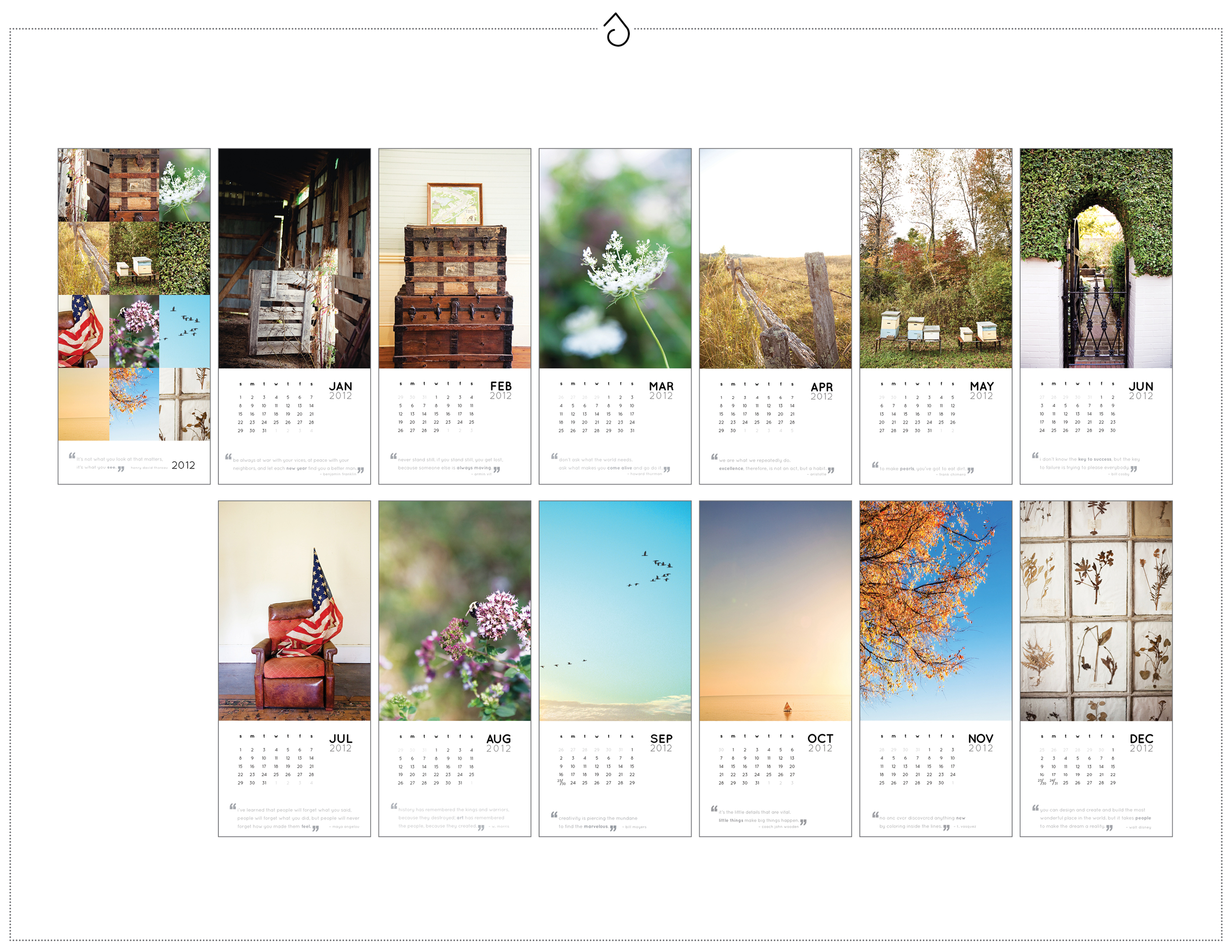
Twenty-Twelve {2012} - Images from around local farms, abandoned homes and other rustic travel adventures from '11 - featured in a vertical format. 4.25 x 9, on 14pt recycled matte with soy-based inks. Packaged in a kraft open-end coin envelope and …

Twenty-Twelve {2012} - Images from around local farms, abandoned homes and other rustic travel adventures from '11 - featured in a vertical format. 4.25 x 9, on 14pt recycled matte with soy-based inks. Packaged in a kraft open-end coin envelope and sealed with washi tape.

Twenty-Thirteen {2013} - Oh Equus. How you are close to my heart. This edition features images from the previous year of my life in horses, all models shown I know and love. {And of course my own Lola makes several appearances} 4 x 6 horizontal, on …

Twenty-Thirteen {2013} - Oh Equus. How you are close to my heart. This edition features images from the previous year of my life in horses, all models shown I know and love. {And of course my own Lola makes several appearances} 4 x 6 horizontal, on 14pt recycled matte with soy-based inks. Packaged in a hand-stamped muslin bag with kraft pennant tag.

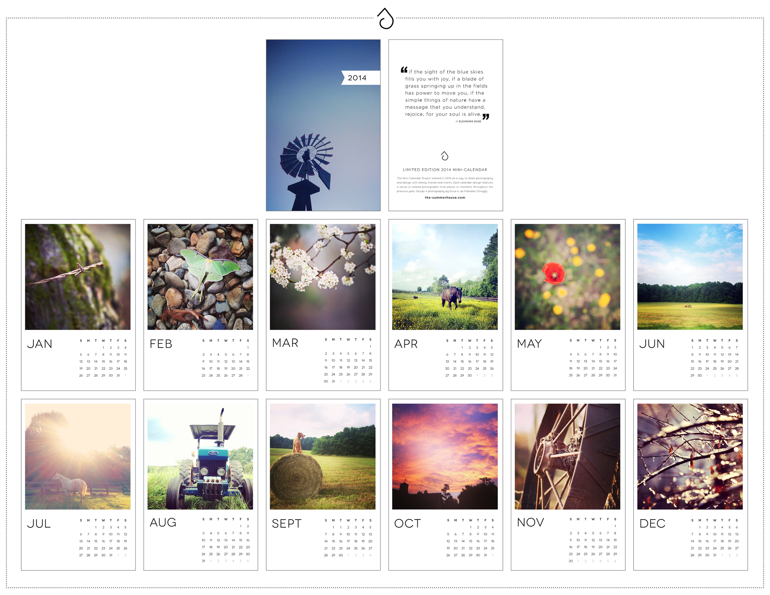
And so, when it came time for 2014, and I looked back on all of the life changes, memories and images the previous year has held, the choice was obvious. This year's fifth-anniversary edition would feature photographs from Rocky Creek, a place that has become so special to myself, my husband and our family and friends over the past 12 months. 

010114Update_Design_Print.jpg

For some receiving this calendar, the images are familiar, as they graced our wedding RSVP cards not that long ago. For me, the images will keep my mind and heart motivated through 2014 as we work to share this property with others in need.

And on the inside cover, this quote:

"If the sight of the blue skies fills you with joy, if a blade of grass spraining up in the fields has power to move you, if the simple things of nature have a message that you understand, rejoice, for your soul is alive."
// Eleonora Duse

{Copies of 2014 still available - contact me if you would like one!}

suite-hearts: me + him {main invitation}

You always think you have more time than you do. When Bryan and I got engaged last September, and finally decided on our wedding date(s) about a month later, I marked my calendar with "July 1 - Send Invites to Print" and "August 1 - Mail Invites". At the time, my first of those deadlines was over eight months away. And then, all of a sudden, it wasn't. 

I was excited, and anxious, about designing this suite. I put the pressure on myself to make it perfect. After all, potential clients look to your own work as a reflection of what theirs might be. I knew I wanted it to be simple, yet different. I knew I wanted it to be touchable, save-able. And I also knew I wanted it to be representative of us, and where we currently are in our lives.

That place we currently are in our lives.... is Rocky Creek. A once-in-a-lifetime opportunity landed us at a historical farm property in the foothills of the Blue Ridge Mountains, about an hour from our Uptown life.  A chance to live, literally, among the trees, nature and most importantly, my horses. And for those who know me well, you know what a big part of my life that is. We packed up last Winter, rented our much-loved Plaza-Midwood bungalow and headed for "ranch living." If you follow me on Instagram, you might feel as though you live here too. 

So, when it was offered for us to have our wedding here as well, we jumped on it. And since Rocky Creek has become our home -- this wedding will truly be a homemade, backyard, personal affair. As I was designing our invitations this past Spring, I knew I wanted that to shine through in the final suite.

Design preview for Erica + Bryan's main invitation in their suite-hearts package. 

Design preview for Erica + Bryan's main invitation in their suite-hearts package. 

A mix of my Scandinavian-white-space-loving roots and a rustic "farm chic" approach, brought me to the final suite – a 1/0 letterpress invite combined with an offset press postcard RSVP, a white-ink-on-20pt-kraft details card, all layered into a slate gray enclosure and sent out in a kraft lined snow white envelope. The RSVP cards each feature a different photograph, all depicting a day in our life at Rocky Creek Ranch.

Design preview for Erica + Bryan's RSVP cards in their suite-hearts package.

Design preview for Erica + Bryan's RSVP cards in their suite-hearts package.

The hours I spent torturing myself on whether or not I *really liked* the final design {that whole, "being your own client" thing again...}, and the additional hours I spent painfully collating each invitation, were all worth it. They mailed on deadline, actually before deadline, to arrive in mailboxes on August 1. At least, those that didn't get lost in the mail did. Ah, #countryliving. 


The final product for Erica + Bryan's main invitation in their suite-hearts package.  1/0 letterpress on 110# crane fluorescent white, combined with a white ink on 20pt kraft paper details card and offset press RSVP postcard each containing a u…

The final product for Erica + Bryan's main invitation in their suite-hearts package.  1/0 letterpress on 110# crane fluorescent white, combined with a white ink on 20pt kraft paper details card and offset press RSVP postcard each containing a unique photographic image. All elements were packaged in a slate gray enclosure and mailed in a kraft-lined snow white envelope with custom address label and rubber stamp.

The aim of art is to represent not the outward appearance of things, but their inward significance.

— ARISTOTLE